

how colour theory injects creativity into the kitchen
We eat with our eyes long before a single bite reaches our mouths. A plate of exclusively grey and brown tones rarely evokes enthusiasm, no matter how refined the flavour combinations may be. Conversely, introducing a visual contrast of deep ruby red, fresh leaf green and bright yellow transforms a simple meal into an inviting work of art.
Colour theory is not reserved solely for painters or graphic designers; it serves as one of the most effective tools for sparking creativity in the kitchen. By consciously considering colour contrasts and the psychological effects of different shades, you break ingrained cooking patterns and discover new ingredient combinations.
Why colour guides our perception of flavour
Our brains are conditioned to link colour with flavour, freshness and safety. In nature, colour reveals the ripeness of fruit and vegetables. Red and orange often indicate sweetness and rich nutrients, while bright green is associated with freshness and vitality.
Scientific research shows that visual stimuli directly influence our perception of flavour:
- Flavour expectation. When we see a bright red sauce, our brains automatically anticipate a sweet or spicy flavour, whereas a bright green soup is immediately associated with fresh herbs or earthy tones.
- Appetite stimulation. Warm colours such as red, orange and yellow stimulate the appetite. Cool shades like blue and purple occur less frequently as primary food sources in nature and therefore evoke a sharper visual reaction.
- Contrast. When a dish consists of diverse, bright colours, we perceive the individual elements more quickly, making the meal both more appealing and more memorable.
However, nuance is required in practice. Although colours influence flavour expectations, plates do not always need to resemble a rainbow. Too many bright colours without a clear focal point can appear cluttered, meaning balance remains the key word.
The kitchen as a studio
To apply colour theory while cooking, you can translate the principles of fine art directly to your kitchen worktop.
- Complementary contrast (opposing colours)
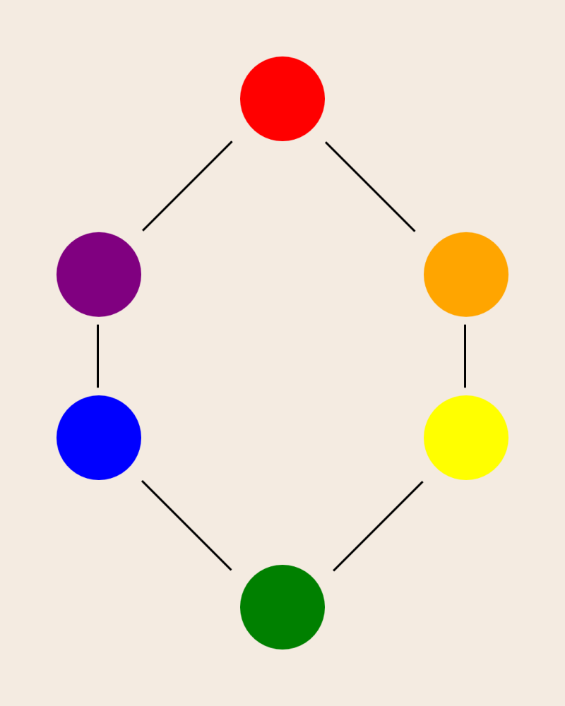
Complementary colours lie opposite each other on the colour wheel, such as green and red or yellow and purple. Presented together, they visually enhance one another. Example: Bright green pea purée combined with crispy, deep red pomegranate seeds and a poached salmon fillet. - Analogous colours (adjacent shades)
Analogous colours sit close to each other on the colour wheel, such as yellow, orange and red, creating a calm, harmonious and warm visual impression. Example: An autumn dish of roasted pumpkin, sautéed yellow peppers and caramelised red onion. - Monochrome with an accent
A monochrome dish uses various shades of the same colour, supplemented with one powerful accent. Example: A white risotto with burrata and white asparagus, finished with a few drops of deep green basil oil or edible violets to draw the eye.
The colour spectrum on the plate
- Red and pink stimulates appetite, radiates intensity and warmth. Ingredients: tomatoes, pomegranate, beetroot, tuna, raspberries.
- Yellow and orange provides energy and evokes associations with warmth and sweetness. Ingredients: pumpkin, carrot, yellow pepper, citrus fruit, mango.
- Green is associated with freshness, health and nature. Ingredients: spinach, avocado, garden peas, fresh herbs, pistachios.
- Purple and blue are mysterious and visually stimulating due to their rarity. Ingredients: red cabbage, aubergine, blueberries, edible violets.
- Brown and white. The earthy, comforting foundation and neutral base. Ingredients: mushrooms, grains, cauliflower, burrata, potato.
Inspiration


From colour concept to dish
You can build a meal from a visual concept using a structured approach without compromising on flavour:
- Choose the main ingredient and colour identity
Determine the visual basis and focal point of the dish, deciding which colour should dominate (for example, the deep red of a tuna steak or the soft yellow of polenta). - Select a complementary or analogous counterpart
Consult the colour wheel to create visual tension or harmony, choosing either contrast or a warm gradient of analogous colours. - Devise cooking methods that preserve colour
Cooking techniques determine the ultimate colour result. Blanching makes vegetables a brighter green, while roasting or caramelising yields deep brown, warm tones. Add fresh elements raw or cooked briefly to provide a bright accent. - Add texture and a colour accent during plating
Use sauces, sprouts or herbs like brushstrokes for the finishing touch, such as a spoonful of deep green chervil oil or a dusting of black sesame seeds.
Inspiration


Practical message for the home cook
Cooking with colour theory does not require complicated techniques or expensive equipment; it simply requires a different way of looking. The next time you shop, choose your ingredients not only for their taste or recipe requirements, but also for their colour. By consciously playing with contrast, saturation and balance, you bring variety to the table and stimulate your own creative ability. A colourful plate inspires and turns every meal into a mindful experience.