

the psychology behind a compelling colour palette
Storytelling is everywhere. From the book on your nightstand to the brand on your shampoo bottle, everything tells a story. Yet a narrative consists of far more than words alone. Colour acts as the silent narrator, setting the tone before a single line has been read. Colour direction acts directly on the brain. It evokes emotion, activates memory networks and subconsciously guides decisions. Understanding how colour psychology combines with visual hierarchy allows you to build a narrative that lingers with the reader.
How the brain processes colour
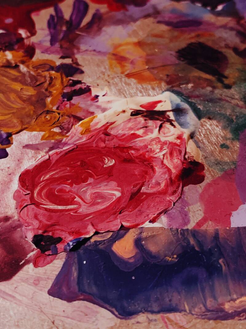
Our visual system processes colour faster than language. When viewing an image or layout, the brain first registers the visual atmosphere before processing textual content. This phenomenon is known as pre-attentive processing. Although individual nuances exist, colours trigger universal associations:
Red: Activates the physical nervous system. It raises the heart rate, creating an immediate sense of urgency, passion or danger.
Blue: Suppresses stress and stimulates the release of calming chemicals. It represents reliability, clarity and distance.
Green and Yellow: Linked by the brain to nature, abundance and sunlight. They evoke feelings of growth, vitality and optimism.
Three levels of colour narrative
Colour guides perception across three progressive levels:
- Emotional Resonance: Colour establishes the underlying mood. A story about innovation feels mismatched alongside muted earth tones, but gains immediate energy when paired with cool blue and cyan.
- Cultural Context: Colours carry societal codes. In Western cultures, white signifies purity, whereas in parts of Asia, it expresses mourning. Considering your target audience's cultural background prevents communication missteps.
- Symbolism and the Isolation Effect: A well-constructed palette uses contrast to highlight core messages. This relies on the Von Restorff effect; whatever deviates from its surroundings automatically commands attention. A bright yellow accent within a grey palette instantly draws the eye to key elements.
Architecture of a colour palette
An effective colour palette is never an arbitrary collection of shades; it follows a functional structure. A proven framework in design is the 60-30-10 principle:
- 60% dominant colour (background): Sets the overarching atmosphere (e.g. calm white, deep blue or warm beige).
- 30% secondary colour (structure): Provides visual contrast and supports the main narrative (e.g. dark grey text blocks).
- 10% accent colour (focal point): Introduces necessary tension and guides the eye straight to the core message.
Three strategic colour palettes
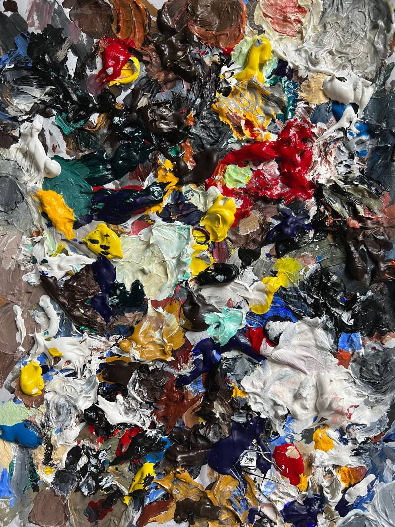
Depending on your objective, a palette can be tailored to specific archetypes:
- The explorer palette (earth tones): deep green, ochre yellow and terracotta. Triggers associations with nature, craftsmanship, adventure and sustainability.
- The serene palette (pastel tones): mint green, lavender and soft pink. Reduces cognitive load, creating space for reflection, well-being and imagination.
- The modernist palette (monochrome + accent): anthracite, chalk white and a single vivid signal colour (such as yellow or orange). Conveys precision, efficiency and innovation.
Practical application: from concept to design
To apply colour theory effectively, clarify these three questions beforehand:
- What is the primary target emotion? (What physical or emotional reaction should the viewer experience within the first second?)
- Are the proportions balanced? )Does the 60-30-10 distribution maintain readability and visual balance?)
- Is the accent colour functional? (Is the most striking colour positioned precisely where maximum attention is required?)
Getting started
Words convey facts, but colour dictates feeling. Combining colour psychology, contrast and structure transforms a static message into a compelling visual experience. Experiment with proportions, eliminate distractions and let colour reinforce your story.